A black and white kitchen is the interior design world’s little black dress—timeless, sophisticated, and endlessly stylish. It’s a classic palette that provides a clean, elegant foundation for any home, whether your style is sleek modern or cozy farmhouse.
However, the stark, high-contrast nature of monochrome can sometimes feel a bit cold or impersonal. The secret to a truly captivating design lies in the “third colour”—the carefully chosen accent that infuses your space with warmth, personality, and dimension.
So, what colour goes with a black and white kitchen? The good news is that black and white are pure neutrals, meaning they literally pair well with every colour on the spectrum. Your choice depends entirely on the mood and style you want to create.
This guide will break down the best accent colours, from classic naturals to vibrant bolds, and show you exactly where to use them to elevate your black and white kitchen from stark to stunning.
The Monochromatic Canvas: Why Black and White Works
Before adding a third colour, it helps to appreciate the power of your base. Black and white is a perennial favourite for several key reasons.
Understanding the Timeless Appeal
Black and white represents the ultimate in contrast, creating a dynamic and crisp look that never fades from style.
-
Versatility: This palette adapts to any design style, from sleek, minimalist cabinets to traditional Shaker doors.
-
Clarity and Cleanliness: White reflects light, making the space feel larger and brighter, while black adds sophisticated definition and grounding.
-
The Perfect Backdrop: Because they are “non-colours,” they act as a neutral canvas, allowing any third colour or material to immediately become the focal point.
The Design Challenge: Avoiding a Clinical Feel
The main issue with an unadulterated black and white scheme is the risk of it feeling too sterile, much like a high-end coffee shop or a clinical lab.
A strategically placed third colour or material is the essential ingredient to solve this. It introduces visual warmth, texture, and character, transforming the aesthetic from purely graphic to genuinely inviting.
The Classic Neutrals: Earthy Tones for Instant Warmth
If you are looking for an accent that will soften the high-contrast look without introducing a bright hue, the classic neutrals—especially materials from the natural world—are your best bet.
The Unbeatable Harmony of Wood Tones
Wood is the single most effective way to add instant warmth and an organic, homey feel to a stark monochrome space. It is the original, non-paint answer to what colour goes with a black and white kitchen.
-
Dark Woods (Walnut, Dark Oak): These create a rich, luxurious, and highly sophisticated contrast, pairing beautifully with matte black cabinets for a moody vibe.
-
Light Woods (Maple, Light Oak, Bamboo): These are ideal for a Scandinavian or modern minimalist style, brightening the space and offering a soft visual texture.
Tip: Incorporate natural wood accents through open shelving, a butcher block countertop on the island, wooden bar stools, or a cohesive wood flooring that runs throughout the main living area.
Grey: The Perfect Middle Ground
Grey is not merely a shade between black and white; it is a Black and white kitchens sophisticated colour that gently mediates the stark contrast. It adds depth without creating a dramatic colour break.
-
Use for Countertops/Flooring: A light or mid-tone grey quartz countertop or concrete-style flooring is both practical and stylish, creating a gentle transition between the dark and light elements.
-
Add Texture: Think about grey-veined marble for a luxurious, patterned accent that is still technically neutral.
Luxurious Marble and Natural Stone
While often containing black, white, and grey, natural stone like marble is more about texture and pattern than colour. It instantly elevates the design to one of timeless luxury.
-
Choose marble with bold, dramatic veining (like Calacatta or Carrara) for a high-impact backsplash or waterfall island.
-
The organic, swirling patterns of natural stone break up the rigid, graphic lines of the monochrome cabinets, adding a soft, artful element.
The Warm Metallics: Adding a Touch of Glamour
Metallics are the jewelry of the kitchen, and warm metals are essential for counteracting the potential coldness of a black and white scheme. They are easily incorporated and incredibly impactful.
Brilliant Brass and Polished Gold
These metals are a current trend that works perfectly with a black and white base, providing a fiery reddish-yellow glow that visually warms the space.
-
High-Contrast Pop: They stand out brilliantly against both black and white surfaces, especially as hardware (handles and pulls) and faucets.
-
Key Placement: Use pendant lighting fixtures in a brushed brass finish above the island to draw the eye and reflect light, scattering warmth across the room.
Rustic Copper and Bronze
For a slightly moodier, more grounded look, copper and bronze introduce an earthy, rustic element.
-
Copper can be used in statement pieces like a range hood or cookware displays, offering a warm, rich patina.
-
Bronze, especially in an antique or oil-rubbed finish, pairs beautifully with traditional Shaker-style cabinets for a classic, sophisticated feel.
Silver and Chrome for a Sleek, Modern Edge
If your goal is a hyper-modern or industrial aesthetic, cooler metals like stainless steel and chrome are the natural choice.
-
Stainless Steel Appliances: They blend seamlessly into a monochrome scheme, maintaining a sleek, minimalist line.
-
Tip: If you use cool metals, be sure to incorporate another warm element, like wood or a textured rug, to ensure the space doesn’t feel too sterile.
Bold & Vibrant: A Pop of Colour for Personality
The high-contrast backdrop of black and white is the absolute best stage for a daring, vibrant colour. Any bright hue you choose will immediately pop, infusing the kitchen with energy and fun.
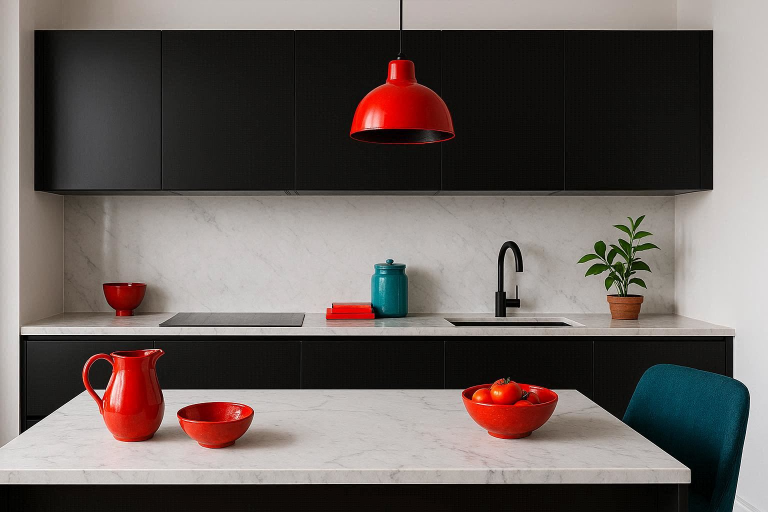
The Dramatic Duo: Red
Red is arguably the most classic pop of colour in a black and white kitchen, evoking a sense of mid-century diner chic or dramatic sophistication.
-
Energy and Intensity: A small splash of fiery red—a stand mixer, a set of bar stools, or an art print—can provide an incredible amount of visual energy without overwhelming the space.
-
Cranberry or Berry Tones: For a softer but still rich look, deeper reds and berry tones can be used in cushions or a statement vase.
Energetic Yellow and Sunny Orange
If you want your kitchen to feel bright, playful, and instantly happy, look no further than warm, sunny hues.
-
Instant Radiance: A yellow accent is like having permanent sunshine in your kitchen. Use it in textiles, small appliances, or even a bold piece of wall art.
-
Orange: Terracotta and deep orange can add a beautiful, earthy warmth while still feeling vibrant, pairing well with natural wood accents.
Rich Jewel Tones: Sapphire and Emerald
For a luxurious, high-end feel that rivals the look of warm metals, jewel tones offer rich colour saturation that is both elegant and grounding.
-
Sapphire Blue: A navy or deep sapphire island base or bar stool upholstery provides a stunning, deep contrast that feels both sophisticated and calming.
-
Emerald Green: This shade pairs beautifully with brass and instantly brings in the feeling of nature. A jewel-toned runner rug or a beautiful set of glassware can make a big difference.
Calm & Serene: Cool Colours for Balance
For those who want to introduce colour but prefer a soothing, tranquil atmosphere over a vibrant one, the softer cool hues are the ideal choice.
Tranquil Blues
Blue brings a sense of calm and clarity to the kitchen, acting as a soft counterpoint to the graphic black and white.
-
Navy vs. Sky Blue: A dark navy adds depth and sophistication (often used on lower cabinets for a ‘tuxedo’ look), while a light sky blue adds a gentle, airy freshness.
-
Coastal Vibe: Light blues are excellent for introducing a coastal or relaxed atmosphere into the monochrome design.
Fresh Greens
Green is the colour of nature, and incorporating it—even minimally—is the easiest way to make a black and white kitchen feel welcoming and alive.
-
Sage Green: This muted, earthy green is a fantastic accent colour, adding a subtle vintage or farmhouse charm.
-
Live Plants: The absolute simplest way to add a fresh green accent is with live plants and herbs on your open shelving or windowsill. This adds life, texture, and natural colour all at once.
Soft Pastels (Blush Pink and Mint)
Pastels soften the entire monochrome scheme, transforming the graphic contrast into a more feminine, airy, and gentle aesthetic.
-
Blush Pink: Often paired with brass and rose gold, blush is an unexpectedly chic accent colour that works beautifully in contemporary settings.
-
Mint/Seafoam: These tones are perfect for a retro or vintage-inspired kitchen, used in appliances or cabinetry hardware.
Expert Tips for Introducing Your Third Colour
Knowing what colour goes with a black and white kitchen is only half the battle; knowing how to apply it strategically is the secret to a successful design.
The 70/30/10 Rule for Colour Balance
Professional designers often follow a loose ratio to ensure balance and prevent the accent colour from overwhelming the base:
-
70% White/Black (Base): The dominant colours in your cabinets, walls, and larger surfaces.
-
20% Secondary (Neutral/Texture): This is often your wood, grey, or marble.
-
10% Accent Colour (The Pop): This should be the bold, vibrant third colour, used sparingly in accessories, textiles, and art.
Where to Apply the Accent Colour
Focus your accent colour on elements that are easy to change, as this is the primary benefit of a monochrome base.
| Area | Application Idea | Style Impact |
| Hardware | Brass or Copper cabinet pulls | Glamour, Warmth |
| Lighting | Coloured pendant lighting or shades | Focal Point, Modern |
| Seating | Upholstery on bar stools or cushions | Comfort, Texture |
| Accessories | Toasters, kettles, fruit bowls, vases | Easy to Change, Energetic |
| Backsplash | Subway tiles in a jewel tone or deep blue | High Impact, Permanent |
The Power of Texture: Matte vs. Glossy
Texture adds depth that colour alone cannot achieve. Layering different finishes is crucial to prevent the space from falling flat.
-
Matte Black cabinets with a Glossy White marble or quartz countertop.
-
Pair a sleek finish with organic, rough textures like woven accents (baskets, stools) or rough-hewn wood.
-
Introduce softness with textiles like a colourful rug or leather bar stools.
Common Mistakes to Avoid When Choosing a Third Colour
Even with the perfect colour in mind, poor application can ruin the effect.
-
Overuse of the Accent: The accent colour should be a pop, not another dominant shade. Don’t use a bold red on your backsplash and your island and your chairs. Limit it to one or two key areas.
-
Ignoring Undertones: Pure black and white is rare. Check if your white paint has a cool blue/grey undertone or a warm cream undertone. This will guide whether a cool accent (blue, silver) or a warm accent (wood, gold) will harmonise best.
-
Forgetting Practicality: In a high-traffic kitchen, a stark white floor or heavily patterned black and white tile can show dirt and wear very quickly. Consider a medium-tone, textured surface like wood or a light grey floor to hide imperfections.
Comparison: Warm vs. Cool Accent Colours
| Feature | Warm Accents (Wood, Gold, Red, Yellow) | Cool Accents (Blue, Green, Silver, Grey) |
| Mood Created | Cozy, Inviting, Luxurious, Energetic | Calm, Serene, Sophisticated, Modern |
| Ideal Style | Farmhouse, Traditional, Rustic, Mid-Century | Minimalist, Industrial, Scandinavian |
| Primary Goal | Adding warmth and making the space feel ‘homely’ | Adding visual depth and maintaining a sleek look |
| Best Placement | Hardware, Wood Countertops/Flooring, Small Appliances | Backsplash Tile, Island Paint, Glassware |
FAQs
Is a black and white kitchen still in style?
Absolutely. Black and white kitchens are universally considered timeless and perennial. While trends shift on the type of black and white (matte vs. glossy, two-tone vs. fully monochrome), the colour combination itself is a constant in high-end design. It’s not a trend; it’s a foundation.
What type of flooring works best?
The best flooring is one that adds warmth and texture:
-
Natural Wood or Wood-Look Tile: The number one choice for warmth and balancing the stark contrast.
-
Light Grey or Concrete: Perfect for a modern, industrial feel and helps to camouflage wear and tear.
-
Black and White Checkerboard/Geometric Tile: A bold choice for a retro or highly graphic aesthetic, best used in a primarily white kitchen.
How do I make a black and white kitchen less ‘cold’?
Focus on incorporating natural, textural, and warm elements:
-
Wood: Open shelving, cutting boards, or a wooden island top.
-
Warm Metallics: Brass or gold hardware and lighting.
-
Soft Textures: A kitchen runner rug, upholstered stools, or linen towels.
-
Live Greenery: Plants instantly add life and a touch of the outdoors.
Should my appliances be black or stainless steel?
This depends on the level of contrast you want:
-
Stainless Steel: The most common and neutral choice; maintains a sleek, industrial, and classic look.
-
Matte Black: Great for a bold, seamless, and sophisticated look, especially if you have a lot of black cabinetry.
-
White: Can blend perfectly into all-white cabinetry for an invisible, streamlined look.
Can I use a patterned backsplash?
Yes, a patterned backsplash is a fantastic way to introduce personality and break up large blocks of colour.
-
Monochrome Pattern: Use a graphic geometric, checkerboard, or Moroccan tile in black and white for texture without adding a new colour.
-
Coloured Pattern: A patterned tile that uses your chosen accent colour (e.g., a subtle sage green pattern) is a great way to anchor the colour scheme.
Conclusion:
The beauty of a black and white kitchen lies in its simplicity and versatility. It is an enduring classic that provides the ultimate foundation for personal expression.
When choosing what colour goes with a black and white kitchen, remember your goal is to introduce life and character. Whether you choose the sophisticated warmth of natural wood accents and brilliant brass, the energizing pop of fiery red, or the tranquil calm of sage green, your third colour is the final stroke that turns a high-contrast design into a warm, inviting, and truly timeless heart of your home.