Choosing a color for your kitchen walls is arguably one of the most impactful, yet daunting, decisions in a home renovation. The kitchen is the heart of the home—a hub for cooking, entertaining, and daily life.
The color you choose dictates the mood, influences your perception of space, and must coexist beautifully with your cabinets, countertops, and appliances. It’s about finding the sweet spot between style, lighting, and personal taste.
Fortunately, the trend of stark, all-white kitchens is evolving. Designers are embracing richer, earth-rooted hues and sophisticated neutrals that add depth and personality.
This guide breaks down the top 2025 kitchen wall colors and provides an actionable, pro-level strategy to ensure you select the perfect palette for your space.
The Unofficial Rule of Kitchen Wall Color Selection
Before diving into specific colors, embrace this golden rule: Your kitchen wall color is the backdrop, not the main event.
While cabinets, countertops, and flooring represent a significant, high-cost investment, wall paint is the most affordable way to elevate the entire space. It should complement and enhance the permanent fixtures, not compete with them.
A “good color for kitchen walls” is one that supports your fixed elements, reflects light well, and evokes a sense of welcome and comfort.
2025’s Top-Trending Kitchen Wall Colors
The coming year is all about warmth, nature-inspired palettes, and sophisticated depth. Here are the colors designers are favoring for kitchen walls.
Earthy Greens: The New Neutral
Green has officially cemented itself as a timeless choice for the kitchen. Moving beyond bright mint and basic sage, the current trends lean into moodier, more grounded versions.
-
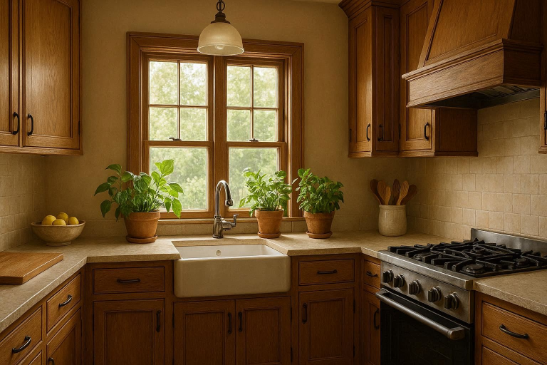
Olive Green: This rich, muted shade is sophisticated and calming. It pairs beautifully with natural wood tones, brass hardware, and creamy white or dark brown cabinets. It brings a natural, grounding feel without being overly bright.
-
Forest Green (as an Accent): For larger kitchens or those with an open concept, a deep forest green on one wall (especially a breakfast nook or pantry area) offers a dramatic, elegant contrast. It’s an excellent way to use a rich, deep color without overwhelming the room.
Warm & Creamy Whites: A Timeless Foundation
While pure, stark white can feel cold, warm whites and yellowy creams remain an evergreen favorite. They are perfect for brightening a small kitchen or for providing a clean backdrop to colorful cabinetry.
-
Creamy White: Shades with subtle yellow or beige undertones (like Sherwin-Williams’ Alabaster or Benjamin Moore’s White Dove) prevent the kitchen from feeling sterile. They reflect light effortlessly and pair well with almost any cabinet finish, from white to dark blue.
-
Soft Beige/Off-White: These colors add a cozy, inviting feel. They are a classic choice that offers versatility and timeless appeal, working well with traditional and farmhouse styles.
Sophisticated Blues: From Navy to Coastal
Blue continues its reign due to its ability to evoke Kitchen Paint Colors both tranquility and energy. The best shades for walls balance cool tones with a touch of gray or green.
-
Muted Blue-Gray: A soft, serene hue that looks lovely in a coastal or modern farmhouse kitchen. It’s a refreshing alternative to standard gray.
-
Deep, Moody Blue (Accent or Lower Walls): Colors like navy blue (Benjamin Moore’s Hale Navy) or even blue-black are stunning for an accent wall. They provide a striking contrast to white trim and upper cabinets, adding depth and a feeling of luxury.
Warm Neutrals: Greige, Taupe, and Brown Tones
As the design world shifts away from cool grays, warm neutrals are taking center stage. They provide the perfect blend of warmth and elegance.
-
Greige: A blend of gray and beige, greige offers a warm, adaptable neutral that works with both cool- and warm-toned fixtures. Look for shades with stronger beige notes for a cozier look.
-
Soft Taupe & Mushroom: These earthy tones provide a rich, grounded atmosphere. They are the ideal choice if your goal is to make the space feel incredibly sophisticated and warm, pairing especially well with natural wood accents and brass.
-
Terracotta/Brown Accents: Earthy orange-brown shades are emerging for accent walls or lower half-walls in a two-tone scheme, creating a cozy, natural ambiance.
Bold & Unexpected Pops: Deep Reds and Cheerful Yellows
If your kitchen needs a serious dose of personality and energy, designers are reintroducing rich, spicy colors.
-
Rich Burgundy/Wine Red: A deep, dramatic hue that can be used sparingly on an accent wall. Red is believed to stimulate the appetite, making it a surprisingly fitting choice for the culinary space.
-
Buttery/Sunny Yellow: A softer, buttery yellow (not lemon yellow!) instantly brightens a kitchen and creates a welcoming, cheerful atmosphere—a perfect shade for smaller kitchens that need an energy boost.
The Pro Guide: How to Choose Your Perfect Kitchen Wall Color
Selecting a good color for kitchen walls is a multi-step process that moves beyond simple trends. You must consider the fixed elements in your existing space.
Factor 1: Analyze Your Kitchen’s Natural and Artificial Lighting
Lighting is the single most important factor. Paint colors change drastically depending on the light source.
-
Northern Exposure: Light here is cool and blue-tinged. Use warm colors (yellowy-whites, creamy beige, warm greens) to balance the coolness and prevent the room from feeling dim.
-
Southern Exposure: Light is bright and warm all day. Almost any color works, but cool tones (blues, cool grays) can help temper the intense sunlight.
-
Eastern Exposure: Light is warm and bright in the morning and cool in the afternoon. Choose colors you want to enjoy in the morning, or a neutral that adapts well (like greige).
-
Western Exposure: Light is cool in the morning and turns dramatically warm (orange/red) in the afternoon. Avoid overly warm colors, which can look fiery in the evening light.
Tip: Always observe your paint samples at three different times of the day—morning, midday, and evening (with artificial light)—before making a commitment.
Factor 2: Complementing Your Cabinets and Countertops
Your cabinets and countertops are the fixed color anchors of your kitchen. Your wall color must harmonize with them.
| Cabinet/Countertop Color | Recommended Wall Color Strategy |
| White Cabinets | Opens up endless options. Use a dark, moody blue or deep green wall for contrast and drama, or a soft greige for a subtle, elegant backdrop. |
| Dark Wood/Black Cabinets | Requires a lighter wall color to prevent the room from feeling too dark and small. Think creamy white, soft taupe, or light sage green to keep the space airy. |
| Gray Cabinets | A warm white or beige wall will warm up cool-toned gray cabinets. A deeper, richer charcoal gray wall can create a sophisticated, monochromatic look in a large space. |
| Colorful Cabinets (e.g., Green, Blue) | Keep the walls neutral. Choose a complimentary warm white or light gray that picks up a subtle undertone from the cabinet color for a cohesive look. |
Factor 3: The Impact of Kitchen Size and Layout
The size of your kitchen fundamentally changes how a color behaves.
-
Small Kitchens: Light colors are typically the best choice as they reflect light, making the space feel larger and more open. Use soft whites, pale blues, or light, airy greens. Avoid dark colors on all walls unless you are deliberately going for an intimate, den-like atmosphere.
-
Large Kitchens/Open Concept: Large spaces can handle richer, saturated hues without feeling cramped. Consider deep colors like navy, charcoal gray, or forest green. In an open-concept space, choose a color that seamlessly flows into the adjacent room’s color palette.
Factor 4: Defining Your Kitchen Style
A good color reinforces your desired aesthetic.
-
Modern/Contemporary: Look for crisp, clean colors like charcoal gray, pure white, or navy blue. The look is often monochromatic or high-contrast.
-
Farmhouse/Rustic: Lean into comforting, natural shades like sage green, soft taupe, or creamy white.
-
Traditional: Opt for timeless, established colors such as deep blues, soft yellows, or a classic warm gray.
-
Eclectic/Bohemian: This is where you can experiment with richer jewel tones or unexpected colors like dusty pink or terracotta.
Tips for Perfect Kitchen Wall Painting Results
Achieving that designer-quality look involves more than just picking a shade; it’s also about the paint’s texture and application.
Understanding Paint Finish (Sheen)
For kitchen walls, durability and ease of cleaning are paramount. Kitchens are high-traffic, high-splatter zones.
-
Eggshell: A slightly more durable option than flat, offering a soft glow and decent washability. It is a good choice for walls if you don’t mind a little shine.
-
Satin: The most common and often best choice for kitchen walls. It offers a subtle sheen, excellent durability, and is easy to wipe clean of grease and spatters.
-
Semi-Gloss: Too shiny for most walls, but it’s the mandatory finish for trim and cabinets, as it is the most durable and washable.
The Importance of Large Paint Samples
Never choose a color from a small swatch. The volume of a color on a large wall amplifies its intensity and undertones.
-
Buy Samples: Purchase a small can of your top 2-3 colors.
-
Paint a Large Swatch: Paint a large area (at least $2 \text{ ft} \times 2 \text{ ft}$) on several walls of your kitchen.
-
Observe: Watch the color throughout the day. Does the sun bring out a pink undertone you didn’t want? Does the color look muddy at night? This testing phase saves hundreds in repainting costs.
Coordinating Wall Color with Backsplash and Flooring
When choosing your color, bring samples of your existing flooring (or a photo) and a spare tile from your backsplash into the light where you are testing the paint.
The wall color should have an undertone that complements the most dominant non-neutral color in your backsplash or countertop (e.g., if your marble has warm gray veins, choose a warm-toned paint).
Common Kitchen Wall Color Mistakes to Avoid
A “bad color” is often the result of an avoidable mistake. Steer clear of these pitfalls:
-
Ignoring Undertones: The biggest mistake. A gray that looks perfect in the store may look purple, green, or blue on your wall because of its subtle undertone interacting with your lighting. Always look for the LSI/NLP term that describes the base color (e.g., a “yellowy cream” or “blue-gray”).
-
Matching Cabinets Exactly: Painting walls the exact shade as your cabinets is visually monotonous. It eliminates contrast and makes the room feel flat. Use a variation—go two shades lighter or darker, or choose a complementary neutral.
-
Using a Flat Finish: Flat paint is nearly impossible to clean, which is a disaster in a high-mess zone like a kitchen. Stick to eggshell or satin for practicality.
-
Painting Only Based on Trends: While trends are inspiring, your kitchen is a long-term investment. If moody charcoal gray is popular but your cabinets are an unchangeable cherry wood, that pairing will likely clash and make the kitchen feel perpetually dark. Prioritize the fixed elements and natural light over a fleeting trend.
FAQs:
What is the most timeless color for kitchen walls?
The most timeless colors are creamy whites (like Benjamin Moore’s Simply White) and soft, light neutrals (like a light greige or pale taupe). They offer a clean slate that can adapt to changing cabinet trends and decor over decades.
Should kitchen walls be lighter or darker than the cabinets?
Generally, the walls should be lighter than the cabinets, especially in a standard-sized kitchen. This creates contrast, makes the cabinets stand out (in a good way), and prevents the room from feeling heavy or cave-like. Darker walls should be reserved for large kitchens or used only as an accent wall.
What color paint makes a small kitchen look bigger?
Light, cool colors make a small kitchen look bigger. Pale blues, light grays, or clean, reflective whites visually push the walls back, enhancing the sense of space.
What is a popular two-tone kitchen wall color combination?
A very popular and sophisticated two-tone approach is to paint the bottom half of the wall (or the lower cabinets) in a rich color (like a deep olive green or navy blue) and the top half of the wall (or the upper cabinets) in a crisp white or light cream.
Is gray still a good color for a kitchen?
Yes, but it’s evolving. Cool, sterile grays are out. Warm grays (greige) with beige or taupe undertones are the popular choice for 2025. They provide the sophistication of gray while maintaining a cozy, inviting atmosphere.
What is the best paint finish for kitchen walls?
Satin is the best all-around finish for kitchen walls. It offers the best balance of low sheen, high durability, and ease of cleaning.
Conclusion:
A good color for kitchen walls is ultimately one that you love and that respects the unique characteristics of your space. The 2025 trends—leaning into earthy greens, warm neutrals, and rich, moody blues—provide a fantastic starting point.
Remember to prioritize your kitchen’s existing elements, especially the natural light and your cabinet color. By testing large samples and opting for a durable finish, you can transform your kitchen from functional space to beautiful, welcoming heart of your home.